Trove Recommerce / Fall 2022
Resale Shopify Theme
The one where I — Designed a flexible architecture that scaled across every new instance, replacing bespoke builds / Built reusable component patterns, not one-off screens, across 100+ configuration points / Traded off flexibility vs. usability using real usage data
Challenge
Design a resale site theme flexible enough to serve as the base template for every partner brand and translate that flexibility into a visual editor that a non-engineer/designer user could operate.
Impact
- Shortened program launch timeline by 43%
- Reduced engineering capital cost per launch by 66%
Timeline
1.5 months of design time, Fall 2022
Context: what is branded recommerce?
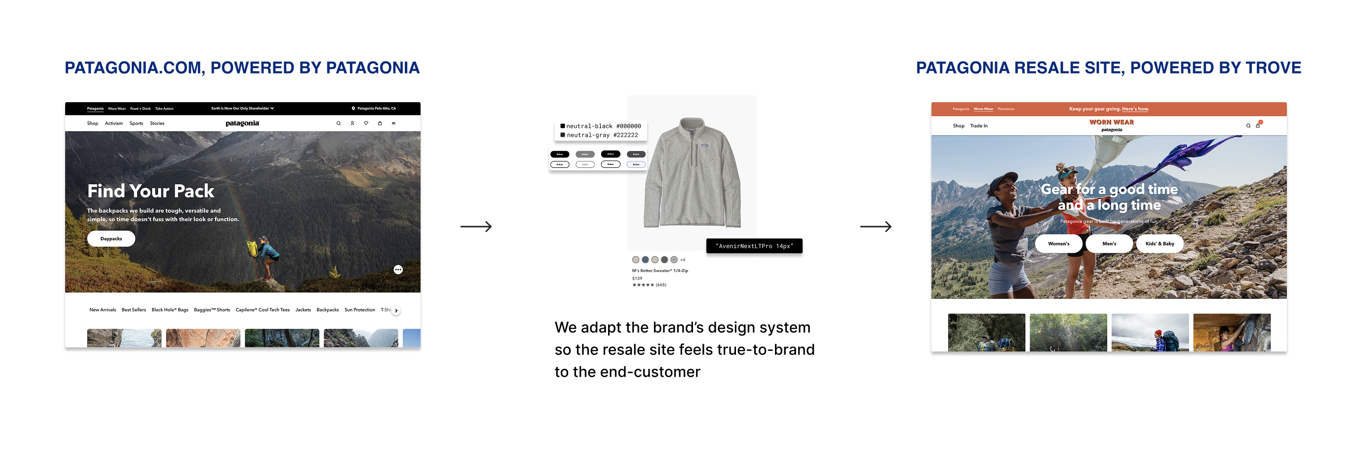
Trove provides white-label technology that powers the secondhand resale program for brands like Patagonia, REI, Lululemon, and Arc'teryx. We manage the resale site but it has to feel entirely native to the brand's mainline site. To build trust of the resale program, shoppers need to feel like they're still buying from the brand, not from us.
The problem
Hitting that level of branding meant building a fully custom resale site for every partner, which required roughly 34 engineer-weeks and 4 design-weeks per launch. That was expensive to maintain and slow to scale.
The solution
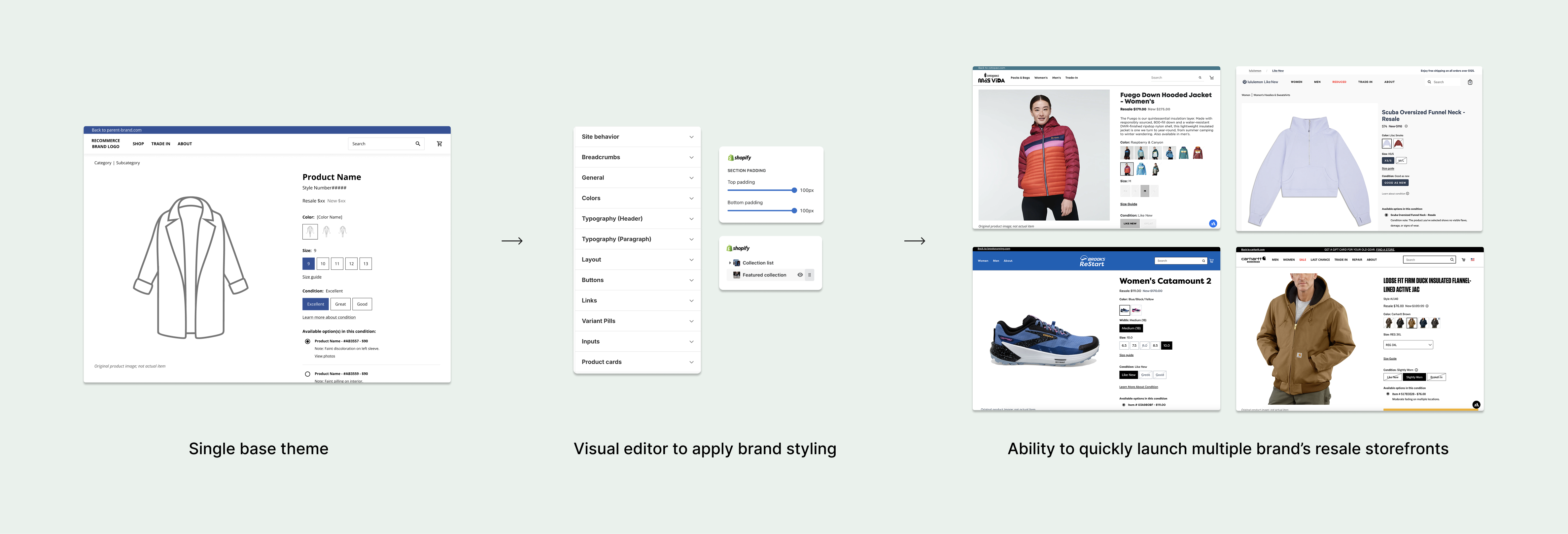
In 2022, we replatformed to Shopify, which gave us the opportunity to modernize the code stack, but also made it possible to build a single base theme that could power many branded storefronts through configurations.
My role
I designed the base resale site theme itself, and the full set of UI configuration options that would let a non-engineer apply a brand's styling through Shopify's visual editor — minimal design or engineering effort required per launch.
The core challenge: "branded-ness" without a thousand knobs
The hardest part of this project was to balance giving the theme enough flexibility to feel authentically on-brand for every partner, without creating so many configuration options that the tool became unusable for the non-technical merchandising managers actually operating it.
I worked backward from the brands themselves — using the range of partners we'd already launched to understand which UI elements actually carried a brand's identity (typography, color, imagery treatment, button style) versus which ones didn't meaningfully register as "branded" to a shopper. That allowed me to apply an 80/20 rule: make the highest-impact elements deeply configurable, and deliberately leave the rest fixed.
Even after that prioritization, the configuration set still ran to 100+ settings — which introduced a second problem: organizing that many controls into a visual editor that stayed comprehensible to someone without a design background.
I structured the configurations around the components themselves (buttons, product tiles, banners) rather than as a flat settings list, so a user could reason about "how does my product tile look" as one unit instead of hunting across dozens of unrelated toggles.
Impact
For the business
- Shortened program launch timeline by 43%
- Reduced engineering capital cost per launch by 66%
- Removed a structural bottleneck on how fast the business could scale to new brand partners
For the design team
- No more full-site Figma files per brand partner
- Significant time saved on onboarding-related design and post-launch styling updates
- Freed up design capacity to focus on core resale UX initiatives instead of repetitive brand builds