Back Market / May 2025
Transformed an e-commerce app as a checkout tool for Back Market's first physical store
The one where I — Redirected the team to move from a self-serve checkout tool to a rep-guided tool, weighing multiple approaches under a 2-sprint deadline / Streamlined the tool to help the primary user work faster in a high-pressure, time-constrained environment / Worked retail shifts myself to validate the design in the field, surfacing gaps no remote testing would've caught
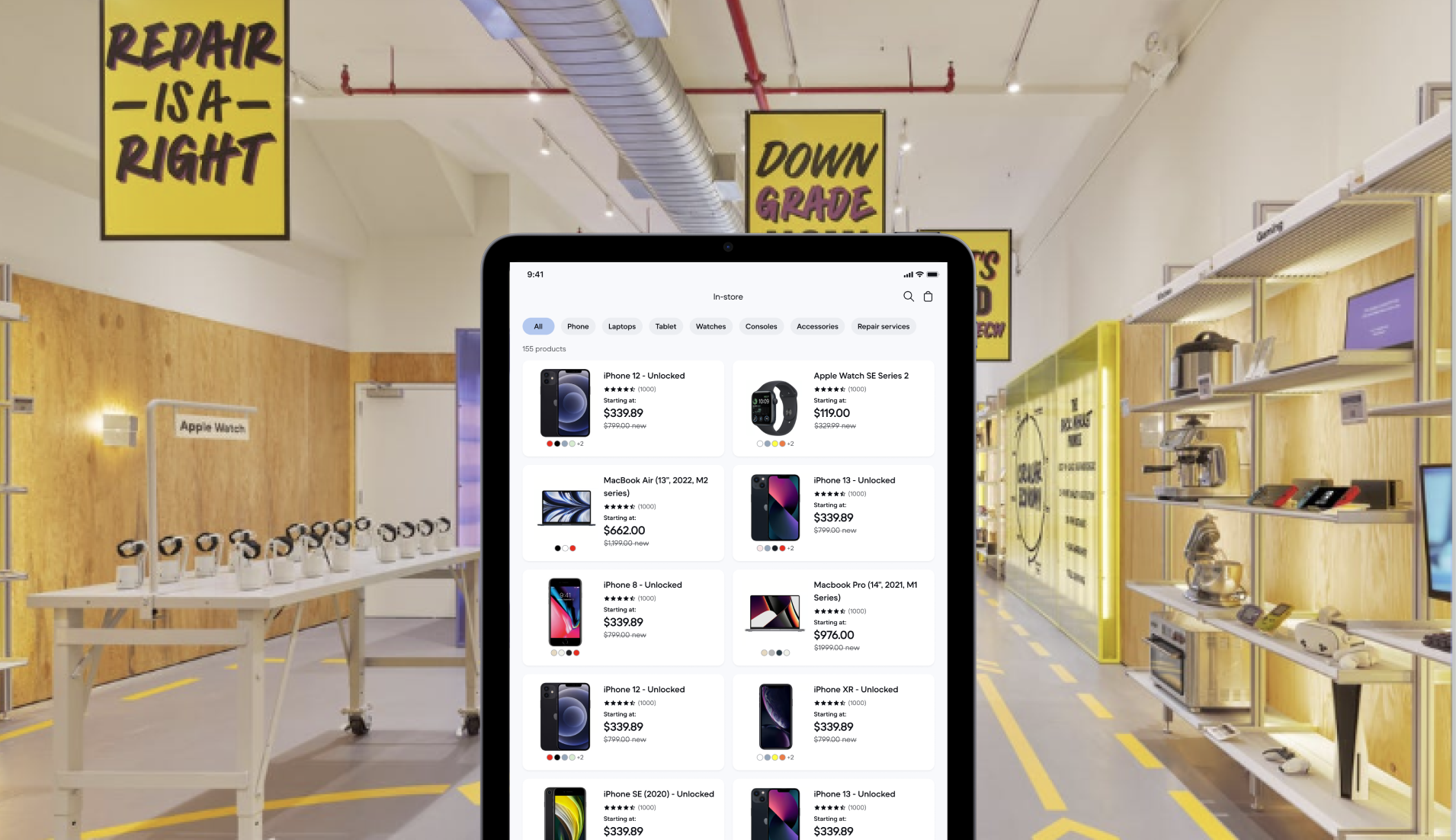
Back Market was opening a 3-month popup in NYC - our first foray into physical retail. We had two sprints, no budget for a custom POS system, and a finance setup that ruled out traditional retail checkout. I transformed our customer-facing app to be usable for the sales rep while keeping as little changes as possible to minimize dev effort.
Timeline
Back Market / 2 sprints
Impact
Processed 500+ transactions to support full duration of popup
The approach
The team initially assumed we needed a customer-facing self-checkout app - something shoppers could use on their own, Apple Store-style. Basically just our existing shopping app but in a bigger screen and less inventory.
I pushed back. Our brand awareness is 2% in New York and most people are not familiar with refurbished electronics. This was going to be a high-touch, guided sale — not a browse-and-tap transaction.
I guided the team to build a tool that would support the sales rep through that journey, optimizing for three key moments: finding inventory fast, building customer confidence in the product, and closing checkout without friction.
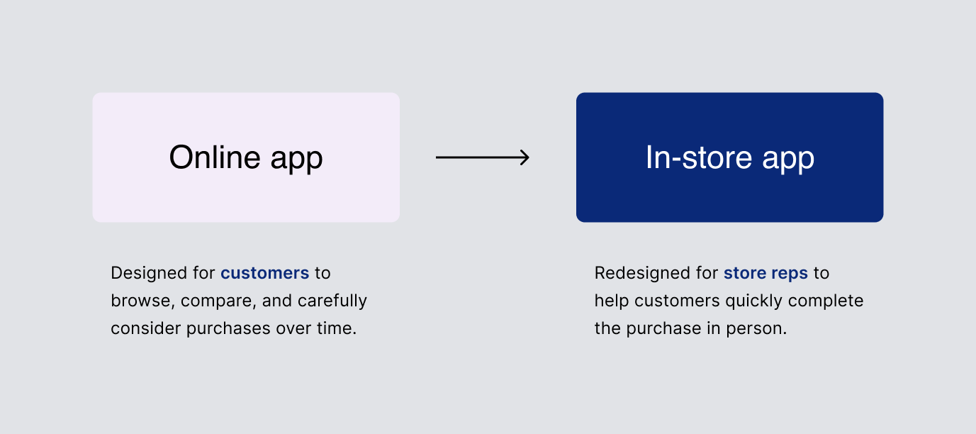
Key changes from consumer shopping app to in-store checkout tool
I guided the team to build a tool that would support the sales rep through that journey, optimizing for three key moments: finding inventory fast, building customer confidence in the product, and closing checkout without friction.
Instant inventory lookup
Our popup showcased devices that weren't all available to purchase. Sales reps needed to answer "do you have the iPhone 13 in blue?" in seconds. I added search and quick filters to solve this - a simple change with outsized impact on rep confidence in the floor.
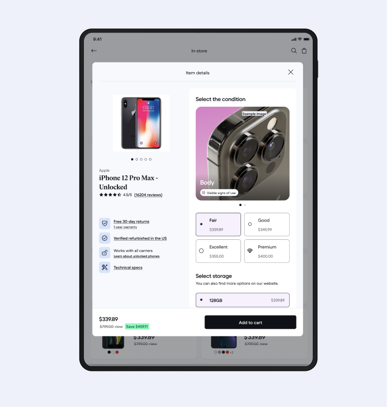
Simplified product pages
In-store, customers are holding the device. They don't need a wall of specs. I stripped product pages to image, model, and price - with warranty, condition, and spec details tucked into expandable sections reps could surface on demand. We validated this was the right call post-launch, because those sections were rarely opened.
Streamlined checkout
I got checkout to ~2 minutes by enabling auto account creation, removing shipping address requirements, and adding scan-to-pay via QR code. 71% of customers ended up using the scan-to-pay option. This was still much slower than the standard tap-to-pay, but workable given our constraints.
Validation
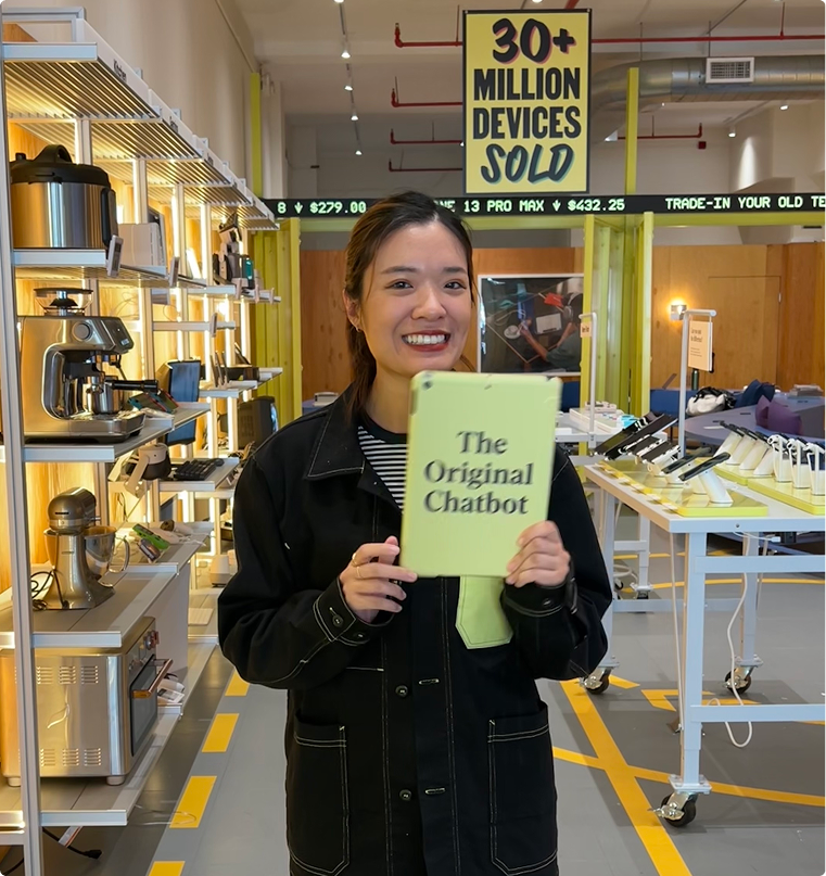
I worked shifts as a sales rep in the popup and used my own design in real transactions.
This surfaced things no user testing would have caught:
- A "browse mode" feature I'd designed for tablets next to devices went entirely unused because the shelves were too small to fit tablets.
- Rep-customer interaction patterns also varied more than we'd anticipated. Some reps handed the tablet to customers for checkout, others kept it themselves, which flagged a design gap we hadn't fully accounted for.
Impact
The tool processed 500+ transactions across a 3-month run without breaking. We built the foundation for an omnichannel experience and insights from the popup directly informed how we talk about refurbishment on the web.